
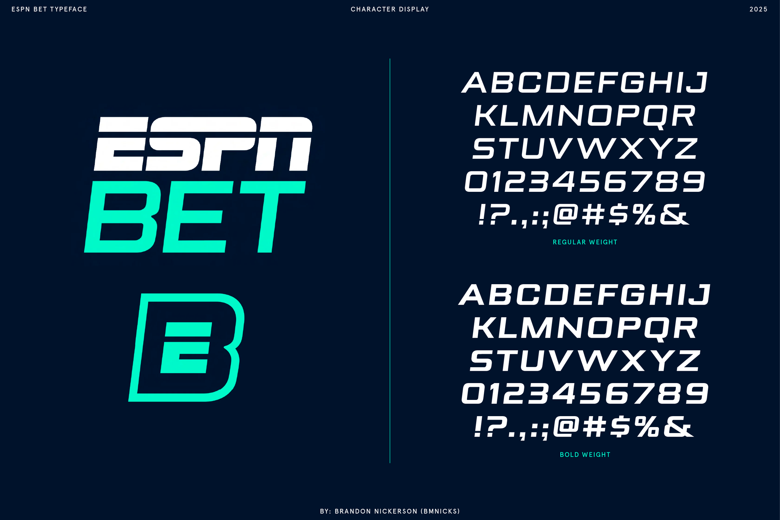
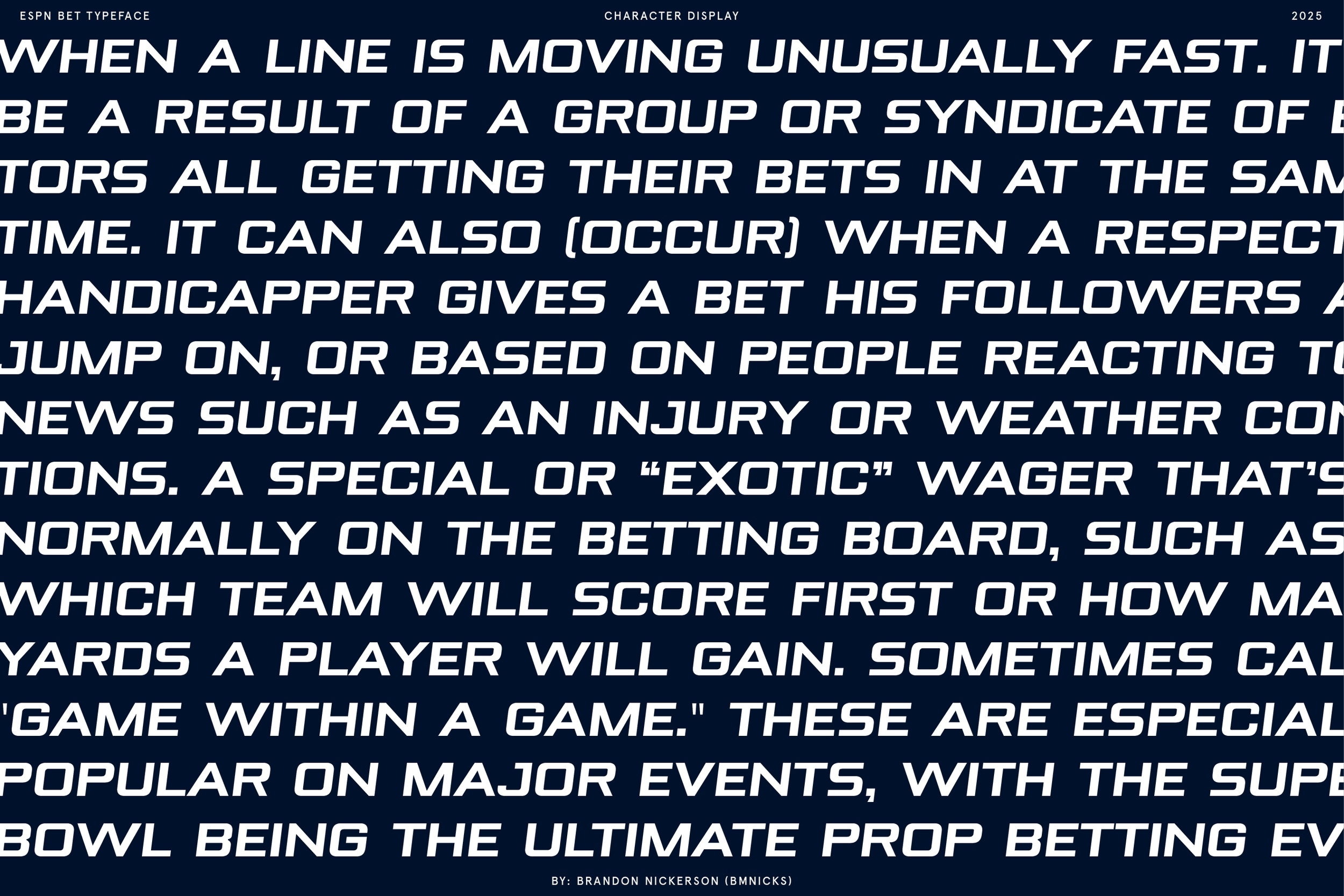
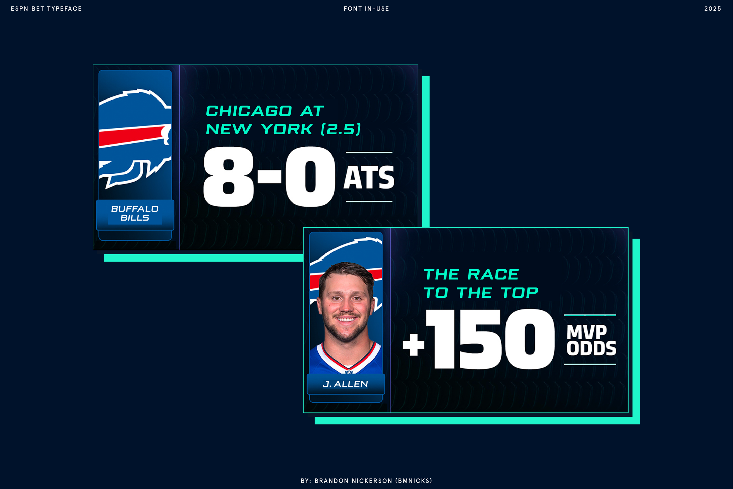
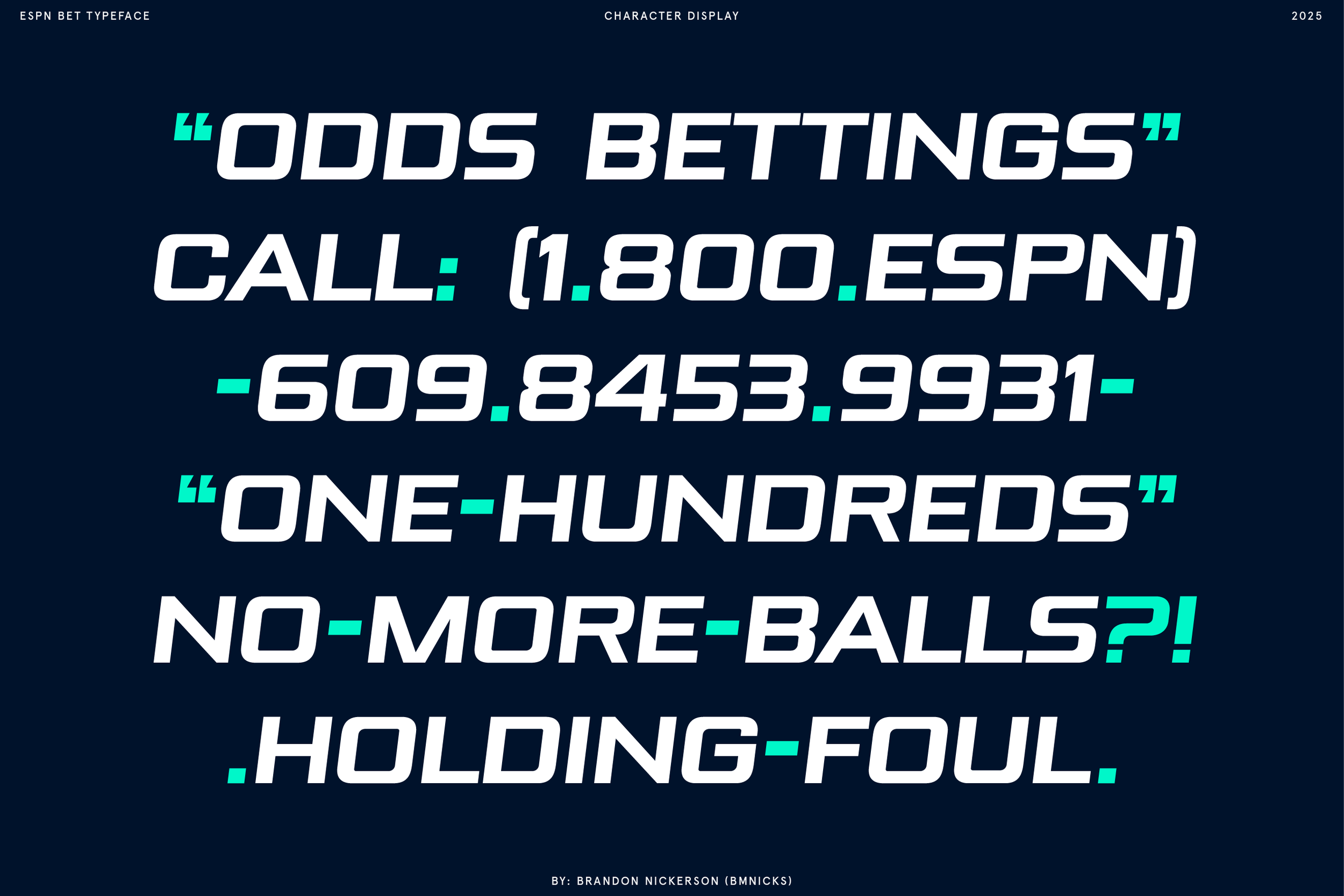
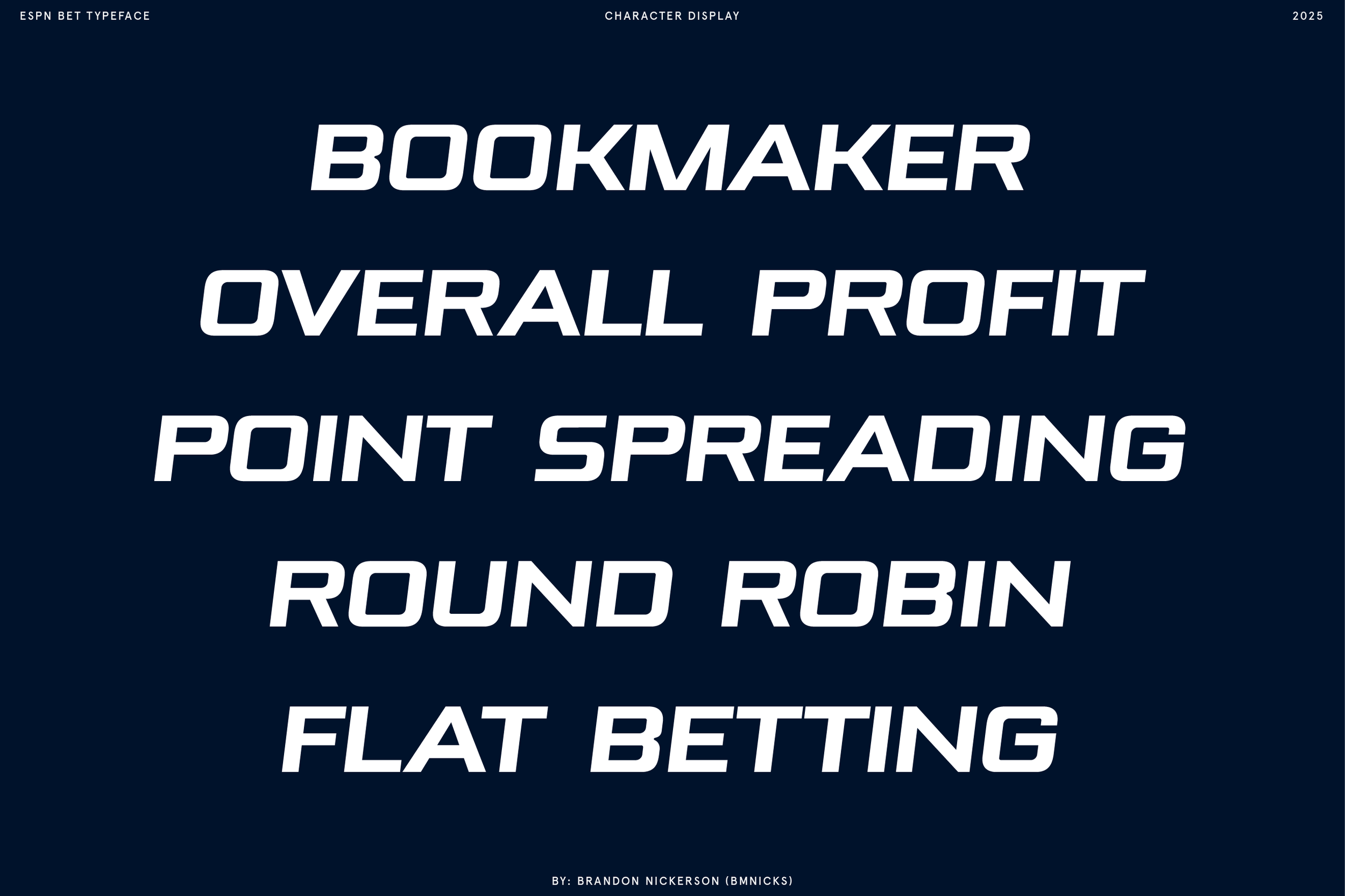
During the launch of ESPN BET, ESPN commissioned a custom typeface designed to extend their existing logotype into a complete system.
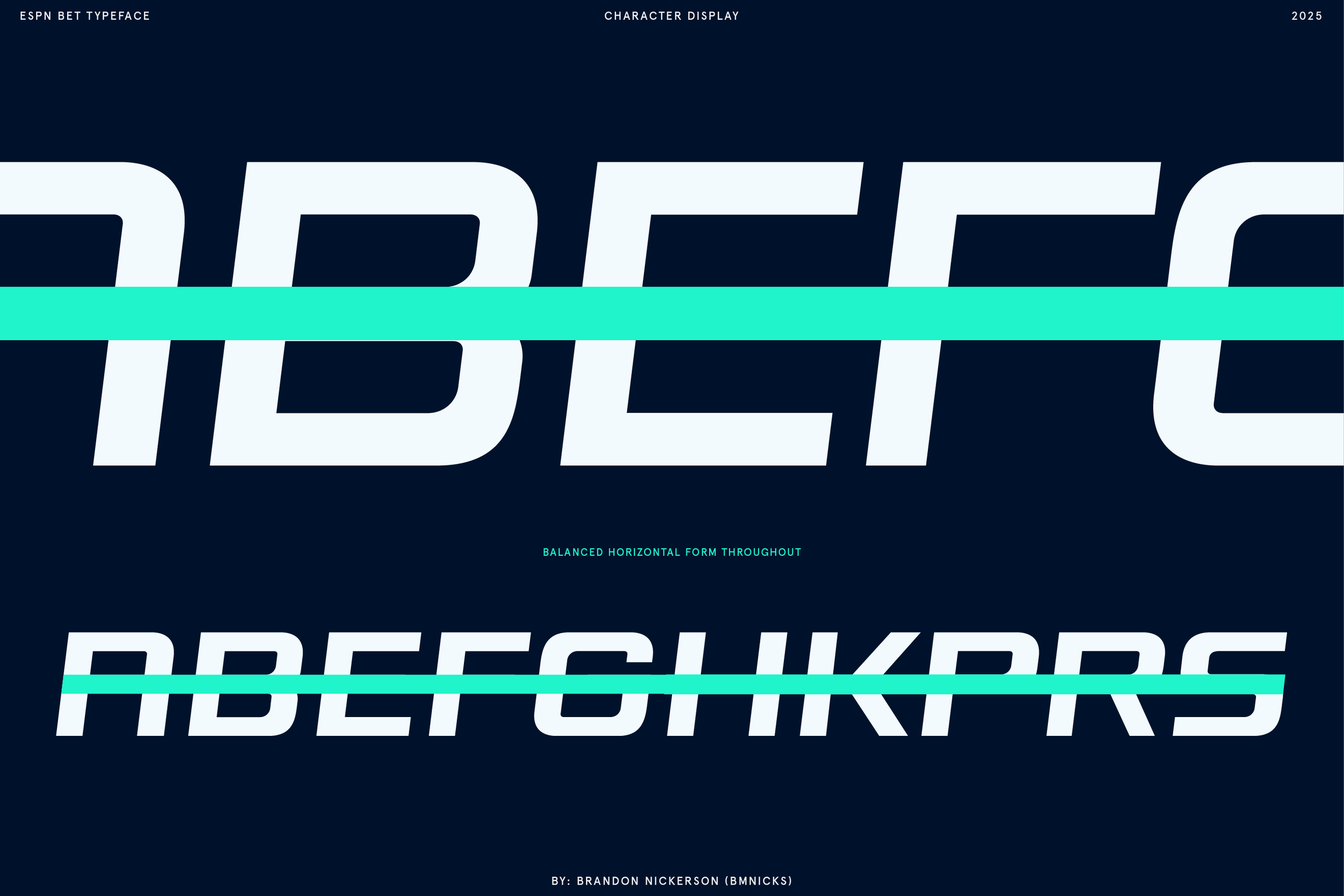
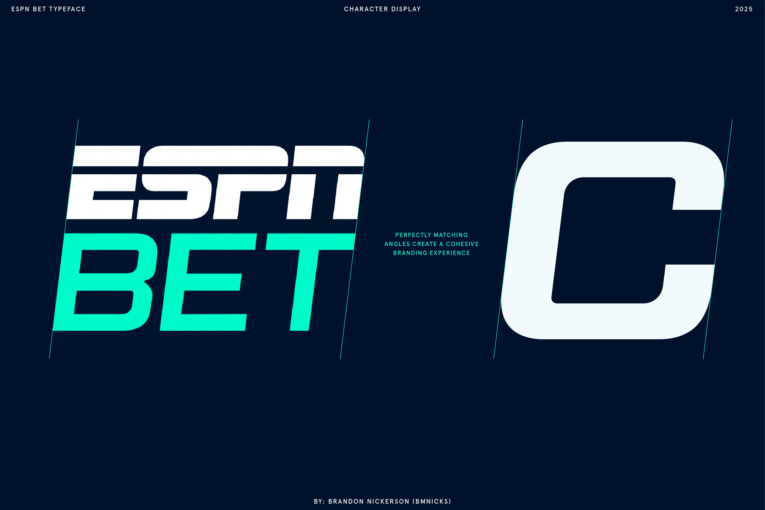
The goal was to create a character set that felt identical to the original mark. This was achieved by precisely matching its angle, proportions, x-height, baseline alignment, and crossbar treatments to ensure complete visual cohesion.
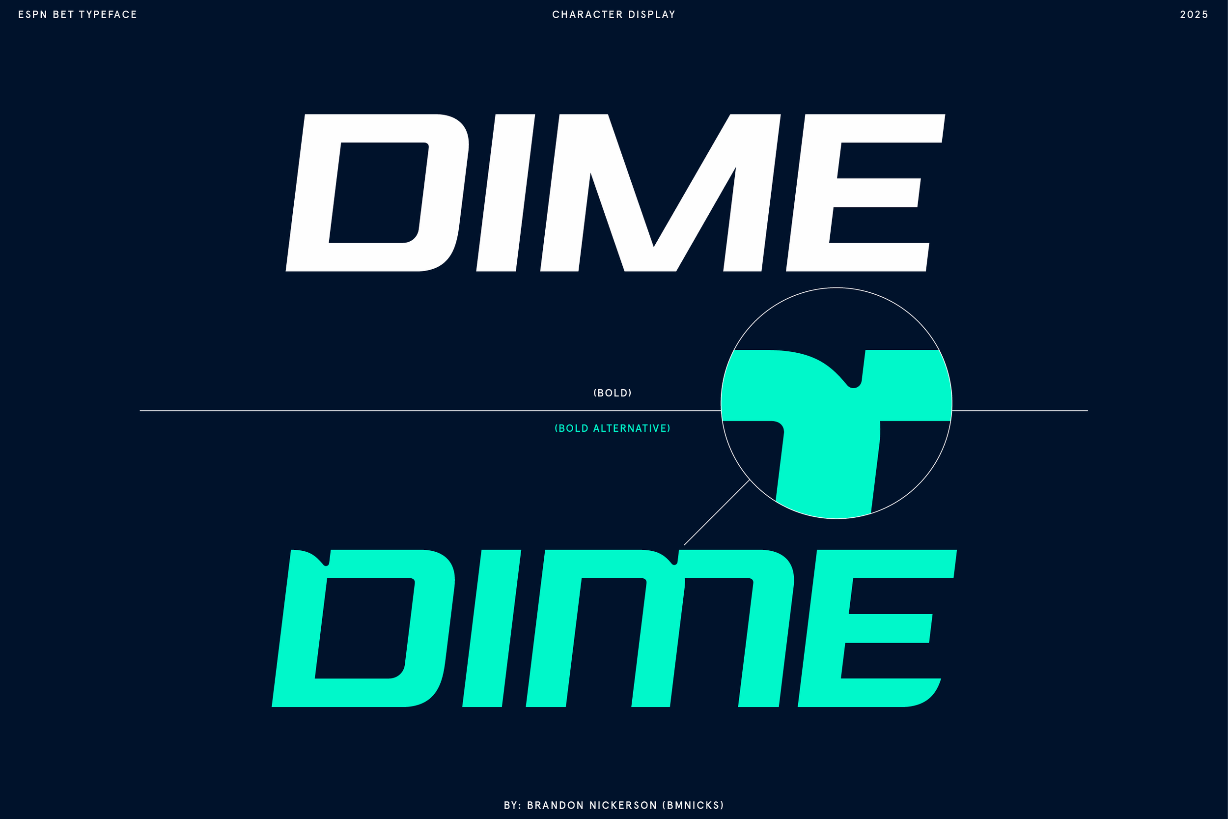
The final result is a brand-aligned typeface with two weights and a range of alternate letterforms, built for flexibility while maintaining consistency with the ESPN BET identity.
ESPN BET
Custom Typeface

Other Projects


